Projects
#DailyUI
A series of design challenges put together to help designers improve their skills by creating a new design or item every day based on design prompts.
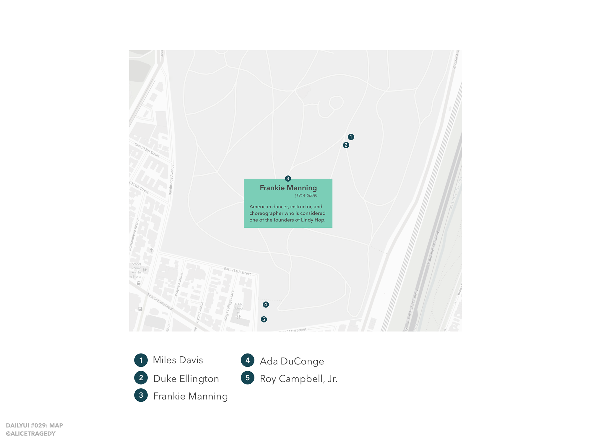
Working with design prompts and constraints was a really good way for me to explore the field of UI design, even if the outcome was based on something purely aesthetic, rather than actual research. It also gave me the possibility to get more comfortable with design tools, and to sometimes explore storytelling-focused design and things I wanted to find out more about. This map, for example, displays the graves of famous people in Jazz music history in Woodlawn Cemetery in the Bronx.
Social Dynamics
My project “Social Dynamics” deals with the social environment during and after the studies. I used a statistical survey as a starting point to get a glimpse into the dynamics of socialising and their importance for graduates’ further artistic development; the data was collected by anonymously surveying 20 graduates.
Throughout the research period, my interest shifted from the collected data to the ways in which we portray data (sometimes incorrectly or by making assumptions based on bias). I used this time to play with the idea of visualising data and explore different possibilities: What if the charts had no key, caption or axes? What if values weren't given units? What if the data wasn't put into context? This exploration led to a collection of graphs and charts at times so abstracted that some of the visualised data is unrecognisable or unreadable.
A separate appendix gives the viewer some of the missing information.

War & Peace
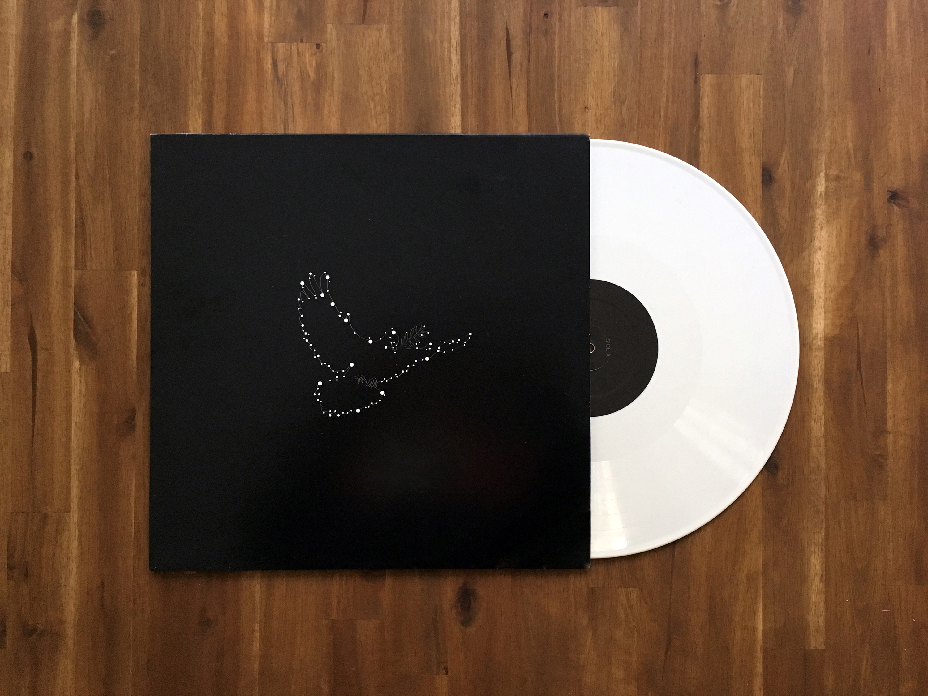
My collaboration with musician Stefan Galler started after I met him at a music showcase; I loved his music right away and started working with him and his band on the release of his first album “War and Peace”. As part of the process, he commissioned the album concept and artwork.
For the cover design I went through several iterations; the first version was a fairly straightforward symbolic representation of the album title, with illustrations of a grenade and a dove. A few drafts in, I moved away from the idea of dualism (black and white, left and right, war and peace, grenade and dove) and decided to go for something slightly more abstract, using star and constellation imagery and only keeping the symbol of the dove.
We used this imagery consistently for the album insert, the website, the artwork for the first album single (“Smile”) and download codes.
The album was released in 2012 and pressed on white vinyl.
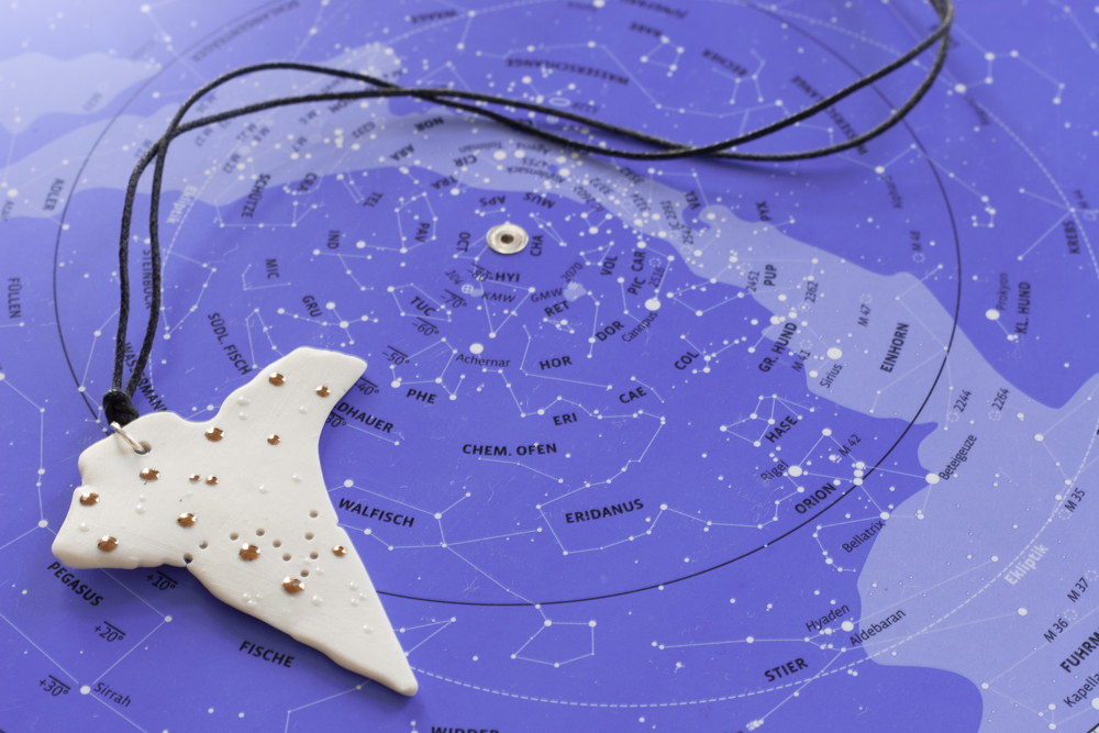
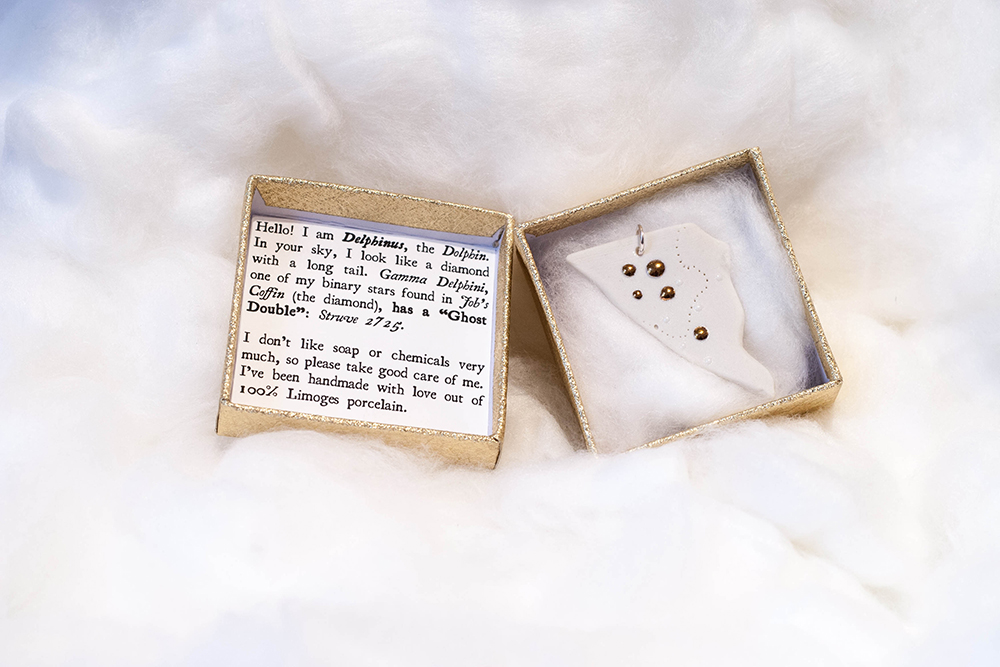
Procyon / Maera
Named after a constellation and a mythological dog, “Procyon/Maera” is a jewellery series on constellations. Each piece is cut by hand from a poured porcelain plate and hand-glazed.
Creating this series came with a long process. Each object is fired three times: Once as a bisque firing (unglazed but fired at the temperature of a glazed piece) for the basic pendant, then once after “drawing” the constellation with white glaze drops, and once more after applying copper luster to the main “stars”.
The pendant constellation series was at first a small experiment, but as the project grew — and as a space enthusiast — I became interested in the story around each constellation.
As part of the branding for the constellation series, I did additional research on everything around each constellation, including their galaxies, stars, and other trivia. Each pendant was packaged in a box with information about the constellation and about caring for the piece.