Many people from my generation who had the chance and privilege to grow up and experiment with tools like geocities, myself included, had a first row seat to a big context and visual shift: The move from the playground of the “personal web” to the professional mass production of relatively bland websites. Now it feels like there is another perspective shift coming as we recognise the value of approaching our personal websites in a slow and deliberate way. Not unlike gardening, the creation of our messy, personal spaces is a constant work in progress; because it keeps growing, it’s also never really done. This post is an attempt to take a look back at how I approached the redesign process, and what I learned along the way.
Why a redesign
I first registered the alicetragedy.org domain in 2007. I was barely 20 years old — a baby really — and even though this wasn’t the first domain I owned, it was the first one that truly felt like it was mine. Over the years it developed and changed by following most of the “personal site trends” (image maps, guestbooks, tiny tiny serif fonts). The last design iteration, from 2012, was actually cute for what it was; if you’ve ever seen an artist’s website you’ll know they’re usually over-the-top, puzzling or just weirdly ugly. In comparison, mine felt pretty minimal, but more and more I was feeling the pain of my three visitors having to look at that site on a mobile screen, images too large but also weirdly cropped on the tiny screen, with text too small to be properly readable. I might be exaggerating, but let’s just say that site was built before responsive design was really a thing. So yeah, long overdue.
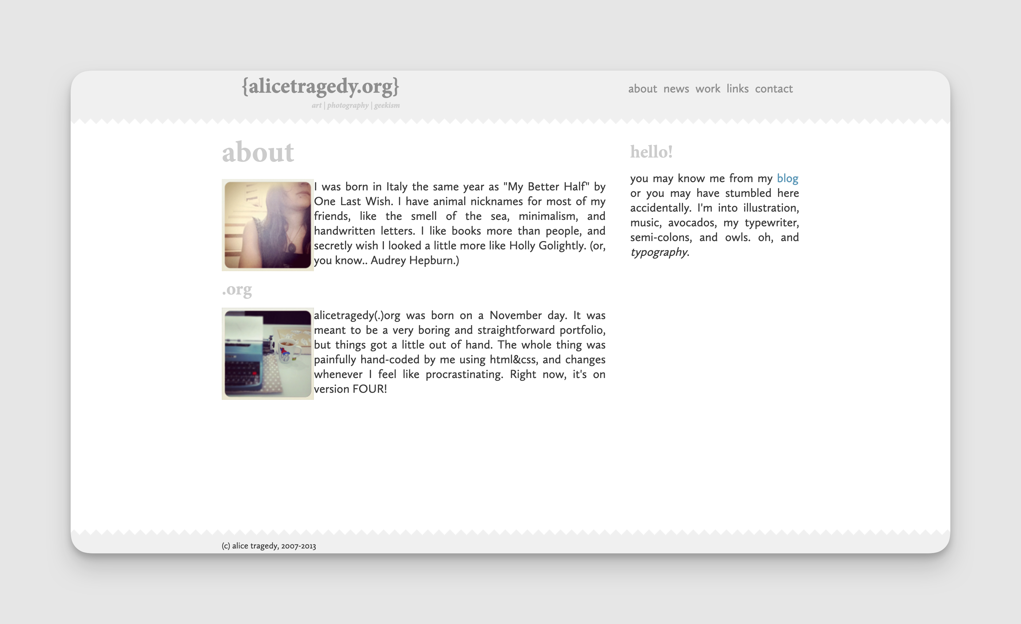
Additionally, my site had a ton of content that I just didn’t really relate to anymore. I was an artist — for a long time that was the core of my being — but eventually, I morphed into a multidisciplinary designer, or a creative technologist, or something more along those lines, and so having an old list of all my exhibitions and videos of my performance art just made little sense. In an ideal world, anyone’s personal website would give you access to the full library of all the things they’ve done and are proud of; but we’ve gotten so used to scrolling and clicking through things without really spending the time needed on them, that so much content would probably be overwhelming, so I had to make decisions on what would need to go.
Getting organised
I had already played with the idea of redesigning my site in 2018, and had slowly been collecting materials “just in case”, but I never really got anywhere. In 2019, an acquaintance of mine, Saron Yitbarek, kicked off the first instalment of her Code Newbie Challenge (CNC) — a challenge with email prompts for the community to help you stay on track with your goal — and I decided to participate. I didn’t end up using the challenge fully to my advantage but it gave me a framework to get started and, most importantly, to get motivated.
I kicked off my redesign project by getting an accountability buddy (Hello Finn 👋 ) and setting a regular (weekly) two-hour slot in my calendar to focus on nothing but the redesign. I was getting regular prompts into my inbox from Saron for CNC on structuring and planning the work, but on top of that Finn took time to do regular check-ins with me every Sunday, where we discussed how far I’d gone that week.
A foundation for my digital garden
As with every good gardening project, I started with the foundation: The soil and the seeds. I bet you didn’t see that analogy coming! I thought about what type of content I wanted to have on the website, and settled on a few basic pages: an about page, a section for writing / blogging, an overview of my most important projects, a list of my community projects and community work, a place for contact information, and an overview of my talks. Last but not least and inspired by my friend Lena who had a page for collaborations on her old website, I wanted to have a page where I could list the types of projects I was interested in working on with people.
Building my personal website always felt like tending to my digital garden and the process of weeding out the “good content” from the unnecessary one became like Kondo-ing my work; I mostly asked myself if it sparked joy, but also wondered: Does this serve my bigger purpose right now? Does this reflect who I am (or who I want to be)?

My next step was doing quick wireframes for my “landing page”. While I love a good, scrollable landing page for products, I knew I wanted the index to be super basic: just a quick intro and a photo of myself (I had just gotten new headshots done by the amazingly talented Zoe Noble), with links that would lead to the other pages. I quickly sketched out 8 different versions of a potential landing page on an A4 piece of paper, and settled on a couple of variations that I liked best and that I would use as a base for my design.
Exploring the possibilities
As a perfectionist I can spend hours tweaking designs, thinking of colours I want to use, and deciding on the perfect typeface. As a teenager, that's what I loved doing most, but this time around, I knew I’d have to leave that to the end and I didn’t want that to be in my way while I needed to focus on other things, so I created a couple of documents where I would dump any inspiration for my site’s “look and feel” as well as articles to read on UI, accessibility, typefaces, and CSS resources. This allowed me to collect everything in one place and avoid going down rabbit holes too quickly.
At the time, my tool of choice for UI design was Sketch (oh hello 2019). So I did what any designer would do: Opened the tool and recreated the “pen and paper” wireframes and then made a couple of super basic, low-fi screens based on the wireframes. Developing less abstract prototypes in Sketch helped me get an idea of the type of page I wanted to create and end up with. For the first time, I worked with placeholder images and text in Sketch using plugins, and it made my work so much faster.
In parallel I also started to code the mockups to get a feel for how it would look on the page: I picked colours and a typeface somewhat at random as a basic first step, with the idea of developing that more later, once the bulk of the work would be done. Alongside collecting the resources and designing and coding the wireframes, I started to think about the actual content: Which projects did I want to keep? Which additional material that was missing did I need to collect? This was helpful to get “real” content into my screens and then my coded HTML page as quickly as I could.
Colour and accessibility
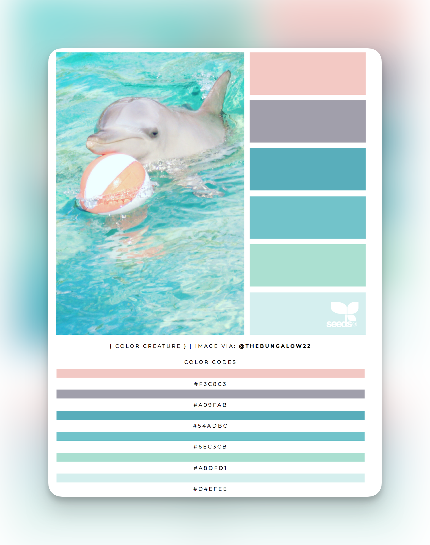
With the basic skeleton page done, I moved onto the fun stuff. To get inspired, I used Design Seeds, a site that would generate a colour palette based on an image. It was a nice way to quickly explore colour possibilities.
Another of my favourite ways to create a colour scheme for personal projects (i.e. when I don’t have limitations because of brand or messaging) when I’m stuck is to use Coolors. I love how flexible and easy to use that tool is: you can generate colour schemes at random, lock the colours you like best, or select another shade for a specific colour. I often find colour combinations I wouldn’t have otherwise chosen, so for me it’s a good starting point to develop a colour palette I’ll be excited about.

I spent a lot of time thinking about the colours I wanted on my site and allowing myself to explore possibilities — I’ve got some screenshots that go as far back as February 2018, and one of my final palette screenshots from September 2018; along with the typography, it might be one of the areas where I spent the most time making tweaks. If you’re a designer, you’ll know exactly what that feels like!
What about accessibility? Generally, I like to focus first on the hue I want and I define a couple of base colours from there — in my case, it was mint/teal and peach/pink. I then make tweaks to saturation and brightness, aided by contrast checker tools, to get the colour I want without compromising accessibility.
My nemesis: Typography
Can I be super honest? I suck at typography. I love obsessing over it and knowing random and useless stuff about type (ascender, descender, bowl, etc.) but I’m still pretty terrible at picking the right typeface for the job. So often in the past I’ve looked up to people with excellent taste (how do they get their typography so PERFECT?!), while my pages would often look like a child had gone in, picked something at random from Google Fonts, and dumped it into a file with complete disregard for the user. As with so many things in design, the answer is practice: it takes a lot of trial and error and of getting things wrong before you instinctively know how to get things right.
At the very beginning I considered a hand-drawn header but I quickly scrapped the idea, because it felt too childish and playful.

I was looking for something both minimalistic and with a personal touch; hand-drawing anything felt like too much, so I considered shadows and large type in what would become my signature colours, but I wasn’t quite getting there.
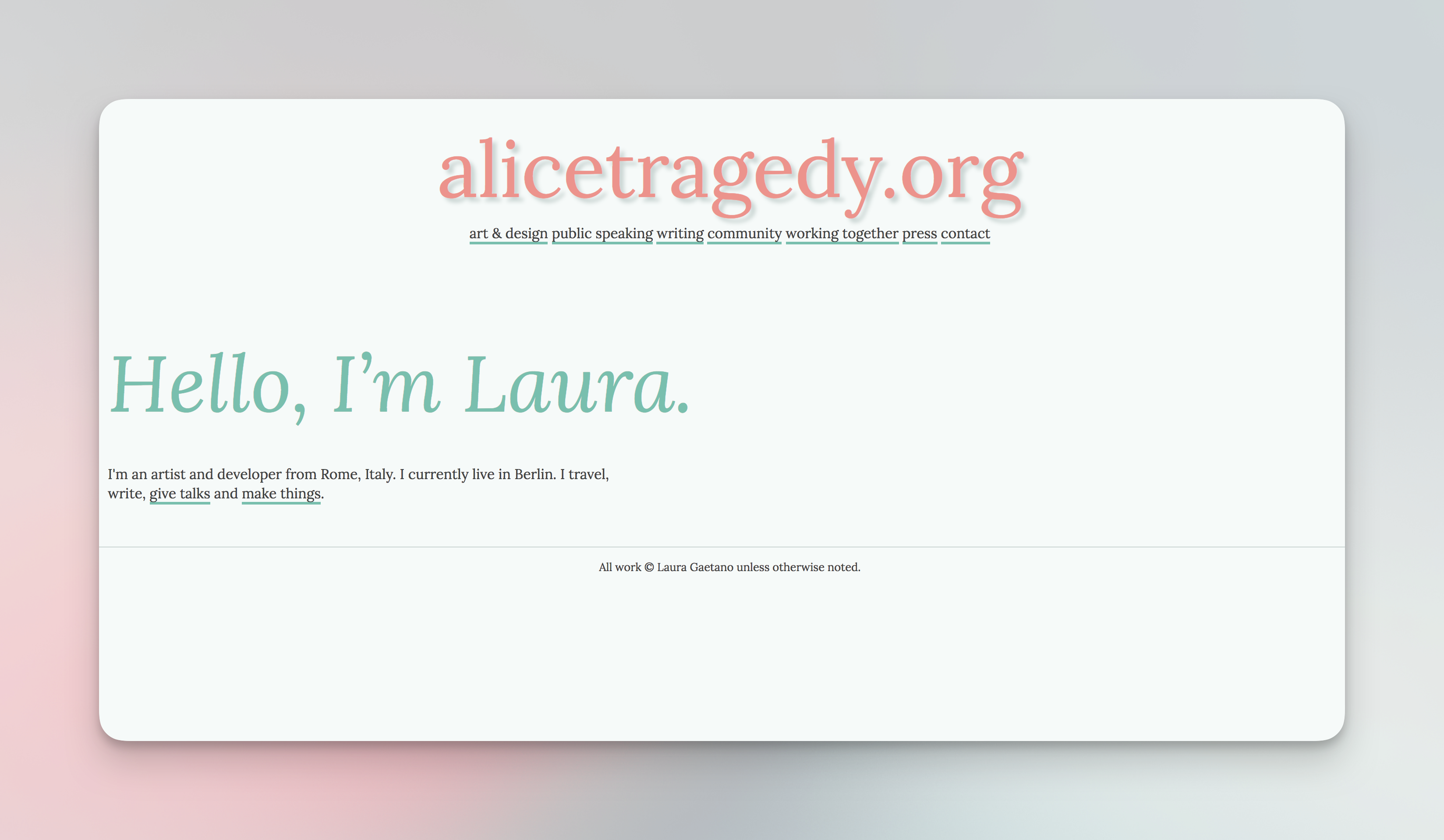
So yeah, I did a lot of experiments with type.
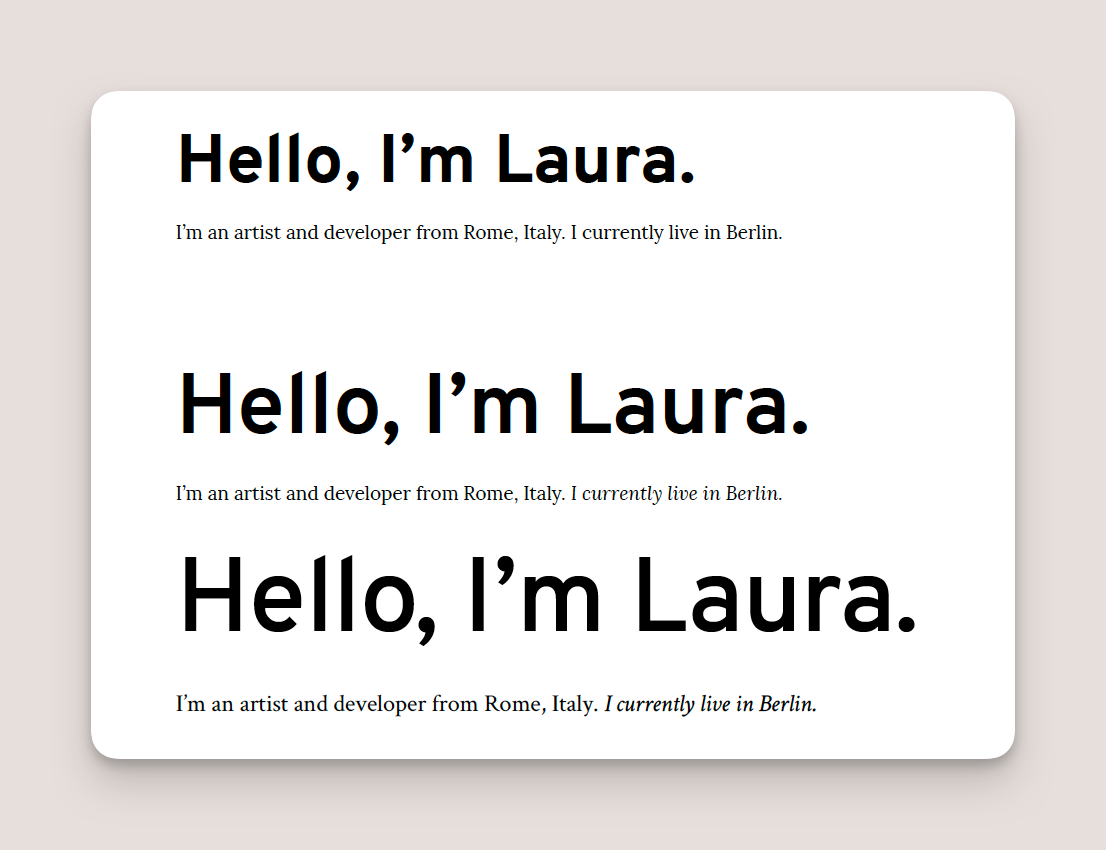
Eventually I settled for two serif typefaces for my headings and body text (Lora and Alegreya, respectively). I was still feeling unsure about it, but I thought I might fix it later if I could put more time and thought into it.
80% done… Now what?
I was already pretty far into my brainstorming for the styles, and continued building a rough prototype of my site in HTML, with all the pages and (rough) content. I was itching to get my site up and running as soon as possible, even if it meant that all of the content wouldn’t be there. Ultimately, this felt like it was better than what I currently had, and I like the idea of designing and building in public (one of the core strengths of open source software).

I thought I was semi-satisfied with the way my site looked. I was into the colour scheme, I loved that portrait of myself, and the “Hello, I’m Laura” headline felt bold and friendly. And yet, I wasn’t 100% sold on it. So I let that design rest for a few weeks (which turned into, well, months).
Fast forward to May 2022 and a group chat with friends where I excitedly wrote:
> I’ve decided to redesign my website again!
> I had been putting off adding some new pages, and I thought it was laziness, and then I realised I don’t like the current look of it after all and it really bugs me
> Still very WIP but here are some quick mockups I made last night!
> It’s definitely more my vibe
I wish I could actually remember what inspired me. I know I was going over some LearnUI Design lessons again, just to review some basics and watch some of the new content I hadn’t had the time to catch up with, and I was also playing around in Figma a lot. I do remember the exact moment of sitting in my (shared) home office working late at night, and showing my partner the first draft of it; but other than that, I don’t really recall how inspiration struck. Like many of the world’s great artworks, my new branding might, in fact, have been a fortuitous coincidence.
CSS Magic
One of the things I was really excited about working with was CSS Grid. I remember building personal websites back when all of the CSS styles would be dumped into the head tag of an HTML file; I experienced the trends of marquees and tiny pixel art, of awful colour choices and iframes, of what we called “chromeless windows”, and of splash pages. Needless to say, the “recent” developments in CSS with flexbox and CSS Grid made my graphic designer’s heart very happy. Suddenly it meant we could design real layouts with more ease and still be super creative, while using all of the flexibility of the web.
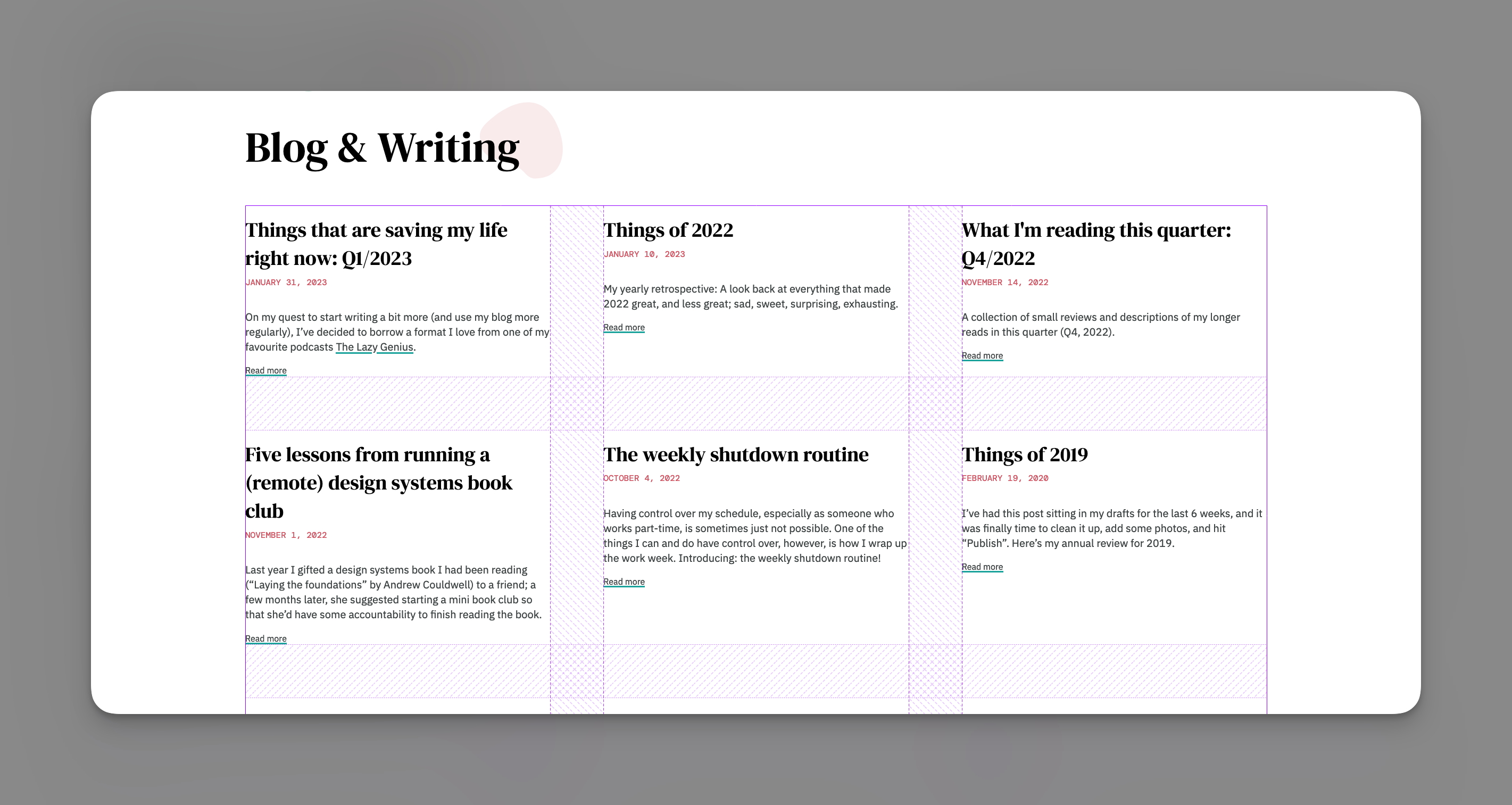
That was one of my main goals: To really learn how to leverage Grid to create something a little special at different breakpoints. If it sounds like a daunting task for a personal site, that’s because it kind of is.
While some of the pages were pretty straightforward to layout (there’s only so many ways you can list your contact info on a contact page), others, like my projects page, did need more attention. I started out by only designing the screens, loosely, at two very specific breakpoints (desktop and mobile). After that, I mainly live-designed in the browser, writing CSS on the fly and using the Grid view in my browser’s Layout inspector to make sure it was looking the way it should.
I love creating designs and mockups in Sketch and Figma, but I know that more often than not, the implemented design will almost never look like the planned design 100%, so using code and the browser just feels more natural for me, and like a better use of my time.

For my projects page, I had a general idea of where I wanted the elements (project title, image or images, project description, and tags) to be at each “breakpoint”; designing and implementing was mostly a matter of trial and error.
For the columns, I often used the css unit fr (“fraction”) as a measurement. Because it’s a proportional unit, it lends itself super well to responsive design — as the viewport gets resized, so does each column — but of course, I still adapted the layouts at different breakpoints.
The images were another thing I struggled with — how do you give images on a “portfolio“-type page a unified look? I originally had tried adding borders, but they didn’t sit quite right with images that had a lot of white in them; and yet, those were the images that really needed to be highlighted well to avoid getting lost in the background of my page. Enter the most underused (by me) trick of all: shadows.
If you grew up in the nineties and experienced all the trends of different types of images and icons and styles on the web, you may have a mistrust in cheesy drop shadows; but adding a subtle spread shadow to my images, and pairing that with rounded image corners, was the best thing I could have done to give those images a bit of depth. On photos or images that have a lot of colour in them, you sometimes can’t even see that there’s a slight shadow right there, and it’s become one of my favourite little details.
Bringing it all together
At some point along the way, I went back to the drawing (or writing?) board when it came to the content, and scrapped half of the existing pages. Remember how I talked about asking myself whether my content brought me joy? As I was collecting some of the work I wanted to show, I realised my “work” section was growing and growing, becoming unmanageable, and it was making me anxious. I nipped that anxiety in the bud and decided to have a single “projects” page with a couple of selected projects I thought were really interesting and showed the breadth of my work; I deleted that “collaboration” page I loved the idea of so much originally; and once I was ready to put some of my writing and blog posts online, I set up a writing page.
Two of the things I like most about the new version of the site are the simple but beautiful typography — the contrast between headings and body text — and the soft, blob shapes on each page. Both add a bit of personality to my site that was previously missing, and I didn’t need pages and pages of content to act as filler; finding the right look and feel really allowed me to let my personal website speak for itself.
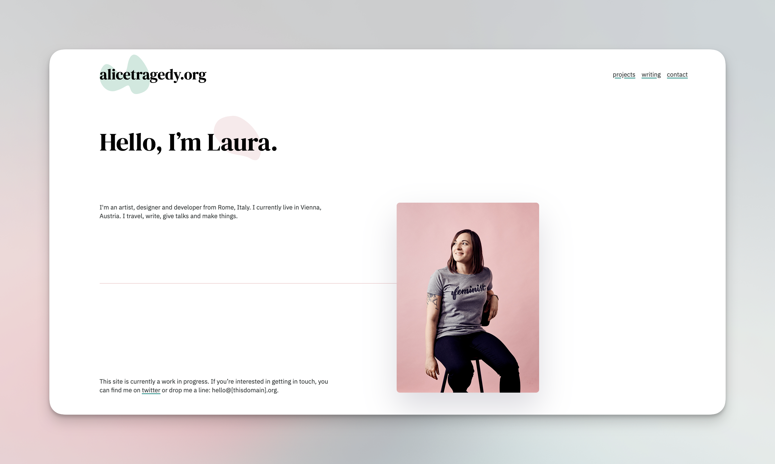
In comparison to the amount of time I spent designing and building that site, the actual launch was uneventful, in that it wasn’t even really a launch: I put everything online one day, added the new pages as I had them, and briefly wrote a tweet or so. That was all.
Continuous improvement
It took me almost four years to get from the original spark of the redesign, to a somewhat final version. That might have been the longest redesign in the history of personal site redesigns, but it was worth it. 6 months later, I am still super happy with the way the site looks because I feel like it reflects me well, and it’s the way my physical space also looks and feels: Clean, no-bullshit and with really small personal touches, it’s got a little bit of personality if you scrape the surface. A friend once mentioned that the process itself reflects who I am: slow, thoughtful, purposeful, and mindful. These are qualities that can get lost in a world where everything feels like it needs to be fast, so maybe, the moral of the story is that not everything needs to be, and some things need their time to develop and to grow.
There are definitely a few things I want to change or improve. In no particular order:
- add an RSS feed
- add a 404 page
- add a /now page
- make accessibility and performance improvements
- make my design system public
- animate the blobs
- think about generating posts locally with a static site generator (right now it’s all handwritten HTML, but I also don’t want to deal with the overhead of styling a static site generator thing)
Redesigning my website was a long process, not (just) because I didn’t have the knowledge or the skills or the tools I needed, but primarily because my personal site has always been an extension of who I was, and I was never satisfied with it just being an about page and a couple of photos of my work; it felt more like shedding a skin than shipping a client project, because this new identity needed time to form.
As we move away from a social media-obsessed web to a (cross your fingers!) calmer, slower, more beautiful web where we are all tending to our own digital gardens and making things that are useless and cool, I keep thinking of bits and pieces I used to have on my very first personal sites — things that didn’t really make sense back then if you think about it (why did an angsty teenager have to post images from their webcam to the INTERNET???) but which just reflected what I needed to have in my own space. I’m seeing a lot of my mutuals taking ownership of their own content nowadays (or attempting to), which is akin to gardening in their own little patch of land instead of walking around tidy and perfect parks they don’t own. The comeback of the personal website means that the internet could go back to how it was pre-1.0: Personal, and messy, and owned by the people.